

Sneakers by Women is an end-to-end responsive site with a focus on ux strategy
Client: Founder of SBW - Julia Lebosse

Background
Founder Julia Lebosse was frustrated by the fact that women are frequently unseen and unheard in the sneaker industry, so she decided to do something about it and founded Sneakers by Women. An online platform/community that celebrates work of the unsung female heroes that work within the industry that shape streetwear and sneaker culture, while shedding light on industry inequalities and problems women face.
Business goals
A subscription-based business model that charges customers a recurring fee either monthly or yearly. The 5 year business goals are:
Increase website traffic to target users
Create a directory of women who offer mentorship services
Create a subscription service to keep women in the loop
Offer strategic partnerships & collaborations to generate income & awareness
The product goal is primarily to increase user visits & engagement through featured women, blog posts, points of contact (directory) & general info.
User problem
The user wants to learn more about Sneakers by Women but when the user accesses the site:
There are no posts or information about the featured women
No easy way to connect for partnership-specific inquiries
No point of contact is displayed beside the founder, Julia Lebosse.
Audience
· Women in the footwear industry
· Women in fashion/retail
· Women in Industrial Design
· Allied Men in footwear industry
· Female Entrepreneurs
Strategic Pillars
-

1. Profit
Make the website more of a product by adding subscription service options and booking informational sessions with industry experts.
-

2. Engagement
Increase engagement to the website by instagram and other social platforms by awareness and establishing a real need for the users to go to the site.
-

3. Partnerships
Partnerships already include: Global footwear awards, Jordan brand & Bodega. The stakeholder wants to scale and expand by offering more opportunities and access.
We need to create more of an active community for the users in order to get the content and connections that they need to have a voice in the community, establish connections, & reach out to the founder for partnerships etc.
As a User, I want to find out about a woman featured on SBW, so I go to the featured page on SBW & search
As a User, I am looking for a partnership, so I go to SBW and I go to the contact for partnerships section
As a User, I want to make connections with women in sneakers so I go to SBW directory pg & get contact info.
…What do our users’ need?
Speak w/ industry experts to learn & grow in speciality fields
Connect with other women in footwear & write sneaker stories
Gain more awareness of women in the sneaker industry
Establish a resource database and archive
Offer partnership opportunities

Original SBW navigation bar
The original SBW site had the home, partnerships about & contact pages. While working with the stakeholder, we determined that it would be valuable to do research on which additional pages would be needed in order to increase traffic to the SBW site.

Julia & I invested time in brainstorming on how we could elevate the existing site, as well as looking at the analytics of top posts & how that could translate to the new site in order to establish a profitable product.
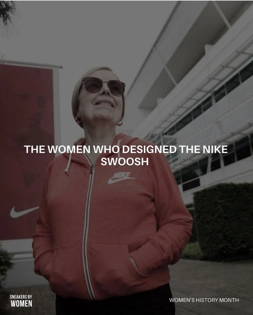

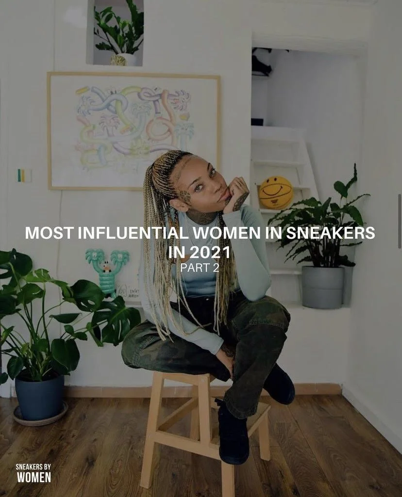

Top posts were added to the homepage for direct Instagram access and sharing options in order to maximize on engagement for both the site and IG.
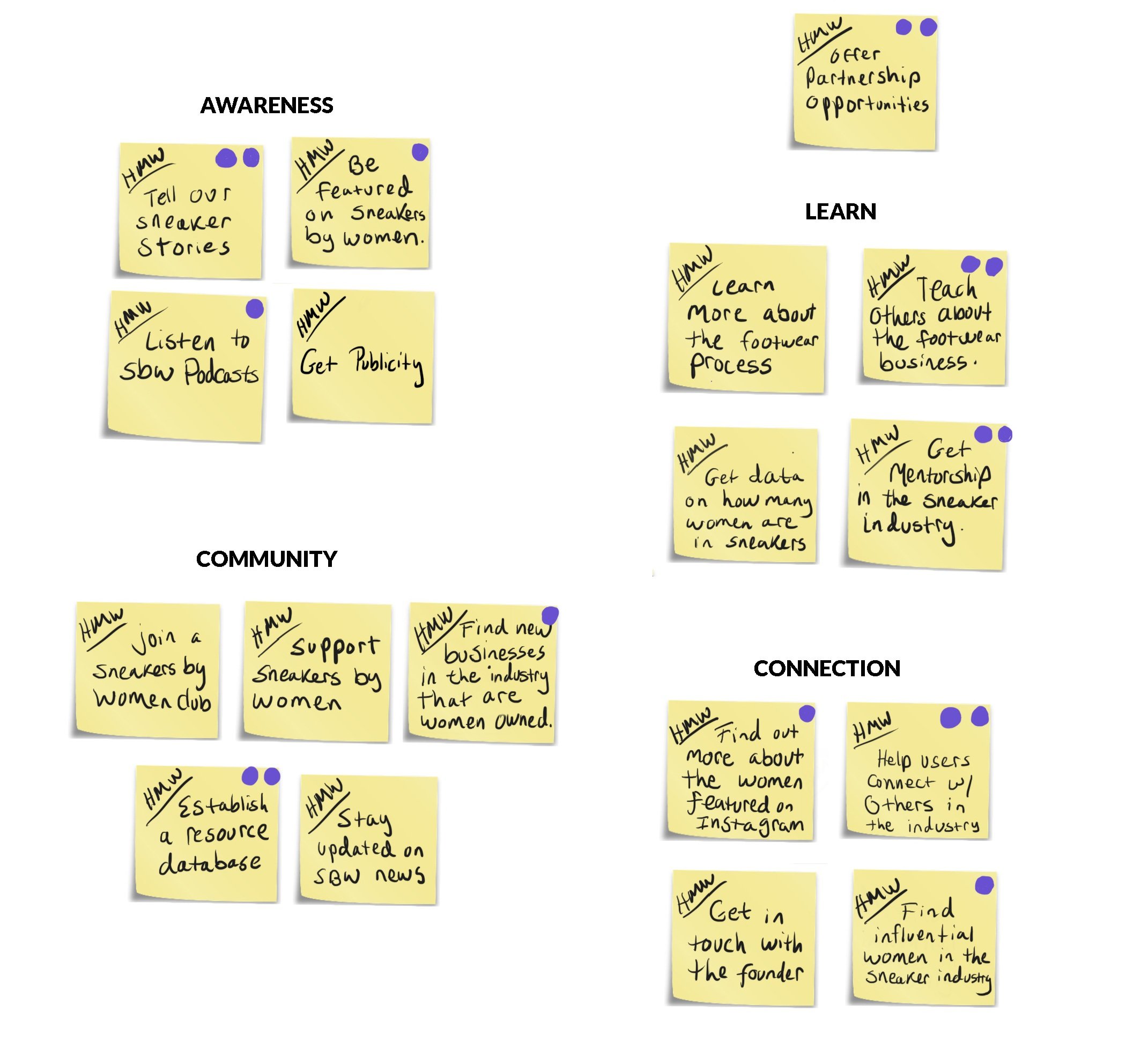
Which categories would you value on sneakers by women?
10 SME’s contributed to the open card sort, our quantifiable data.
AWARENESS
PROFIT
COMMUNITY
LEARN

We need awareness, connection and community in order to have partnerships & we won’t have partnerships unless we have awareness, connection and community.
As the primary stakeholder and I began the iterative process we were back and forth between a white or black background. We agreed that a black background would differentiate us from our competitors.
-
![]()
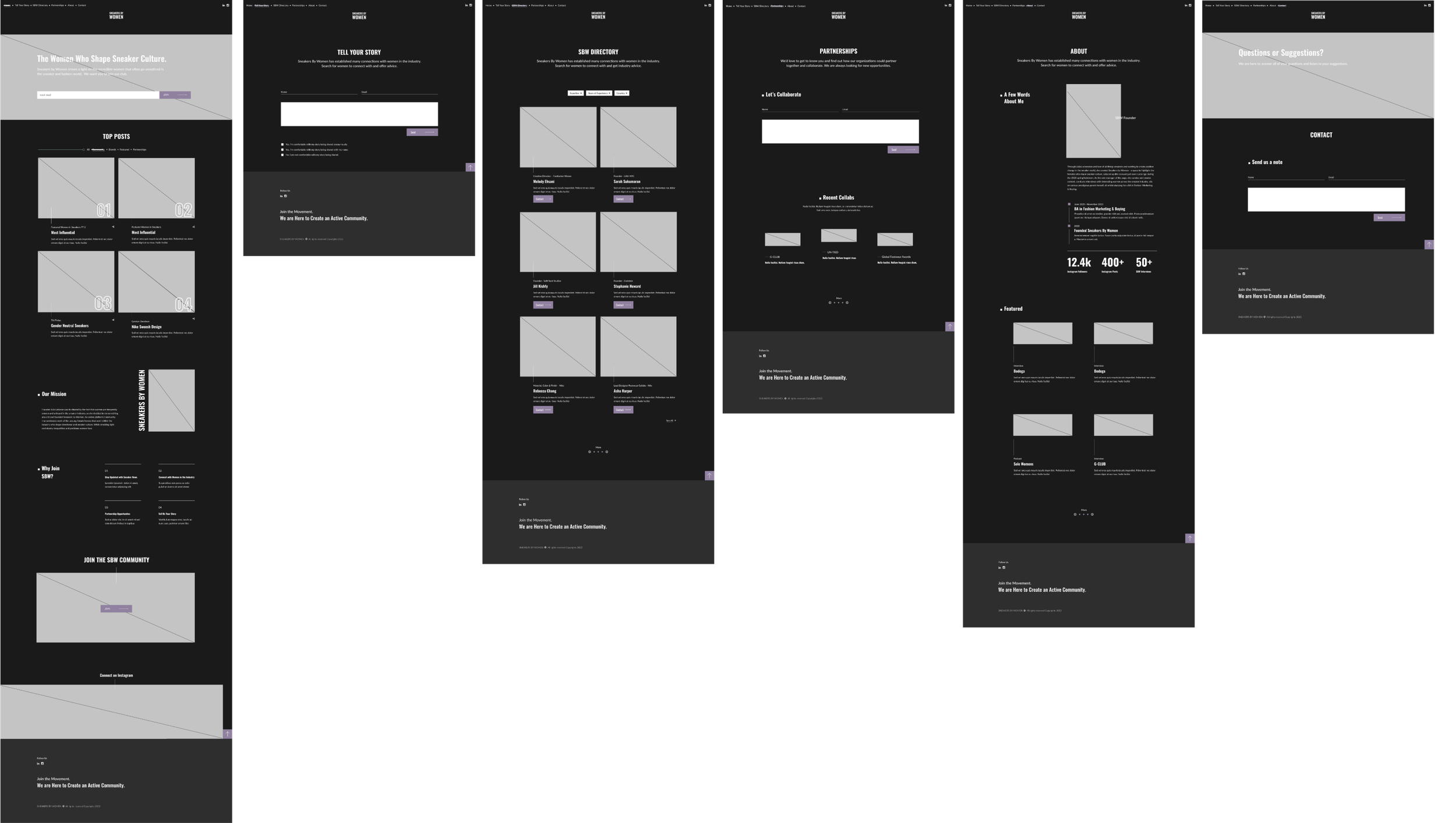
1. Hi-fi wireframes
Hi-fi focused on flow, IA, and layout, clearer About hierarchy, homepage order (intro then top posts), and spacing so content stays readable and scannable
-
![]()
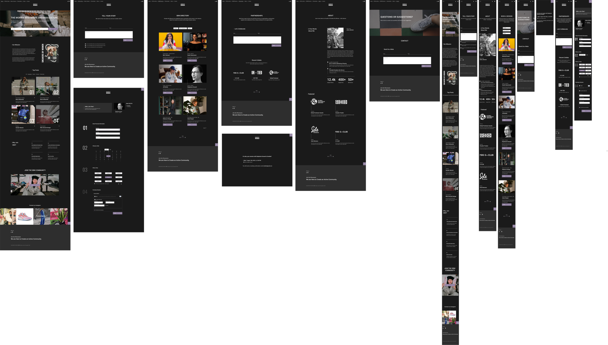
3. Hi-fi final iteration
Final screens went responsive and folded in hi-fi feedback. A usability test on the booking flow drove the last interaction revisions before handoff
White background

Pros: Very clean and minimal, standard, accustomed browsers
Cons: Not enough contrast, strains the eyes, all of the competitors use a white background
Black background

Pros: Reduces eye strain, differentiates us from competitors, is ultra-modern, and can increase the contrast within key features and text colors.
Cons: Appears to reduce space, some images can “pop” too much if there is high contrast, if the line weight is too light the text can be difficult to read
Interaction usability for prototype
The test was taken by 8 SME’s, broken up into three parts:
Task 1:
Search for booking a session with a mentor on the home page
Task 2:
Book Stephanie Howard's informational session
Task 3:
Select the date and time, enter the address/payment information, and check out
What were the results?
8 out of 8
8 out of 8 participants thought the imagery was supportive
8 out of 8 participants thought the booking process was simple, precise, and sequential
6 out of 8
6 out of 8 participants had misclicks due to the nav bar subjects being too close to each other
6 out of 8 participants didn’t know that SBW directory meant booking a session
5 out of 8
5 out of 8 participants wish they could add the appointment to their calendar on the confirmation page
5 out of 8 participants thought the nav bar text was too small
4 out of 8
4 out of 8 participants thought the mentor search dropdown options could be improved in order to have more options
4 out of 8 participants wish they were able to select a topic that they would talk about in their session
Task 1 had the most challenges, as participants were unsure where to click because they didn’t know SBW Directory would direct to the booking page

High level overview for revisions
Edit spacing between navigation & logo
Change SBW directory to book a session
Add appointment widget on the confirmation page
Edit heading size on nav bar and throughout the site
The usability of the website should not impact engagement in a negative way. Therefore, we conducted an additional heatmap study to see the users’ flow and where they click to book an informational session.
